Parceiro da Construção, 2022
Redesigning a platform to boost user satisfaction by 84%
As the sole Product Designer, I led the project from discovery to delivery, partnering with the PO to understand business goals and priorities. I collaborated closely with engineering to deliver a smooth, scalable design.
Team: 1 Product Owner, 2 Engineers
Project summary
Challenge
Parceiro da Construção is a learning platform that had accumulated significant technical debt, creating friction throughout the user experience. Students struggled with basic tasks like tracking course progress, downloading certificates, and accessing materials. Reflecting this, CSAT sat at 51 points and engagement was declining.
Solution
Redesigned the cluttered platform to optimise user workflows and make essential tasks like tracking progress and downloading certificates faster and easier.
Impact
+84% CSAT increase
Within 30 days, CSAT jumped from 51 to 94 points, confirming the redesign addressed the core usability issues.
58 design tokens implemented
Established a design system foundation that ensures consistency across the product.
The design problem
Usability testing and support ticket analysis pinpointed friction in high-traffic areas — course listings, video screens, and certificate downloads — where task completion rates were lowest.
These usability gaps led to reduced engagement and a noticeable decline in the platform's perceived value.
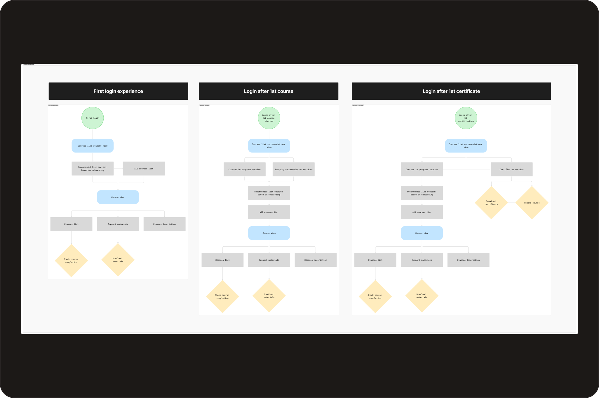
A new user journey
By mapping user journeys across three key states (first login, active learning, post-certification), I identified different scenarios and decision points users would encounter. These maps became a shared reference that aligned the team, defined scope, and ensured the design responded to where each student was in their learning journey.
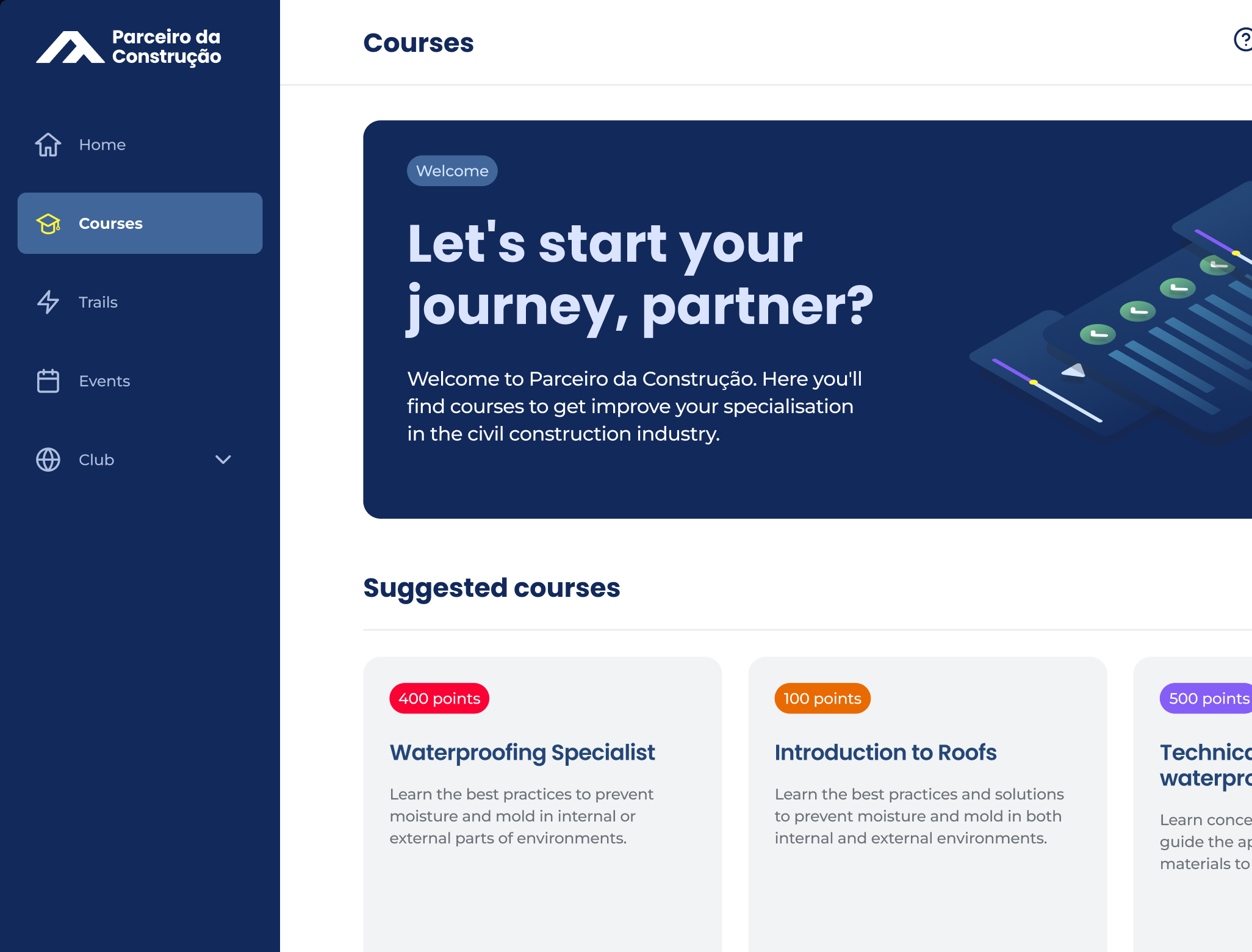
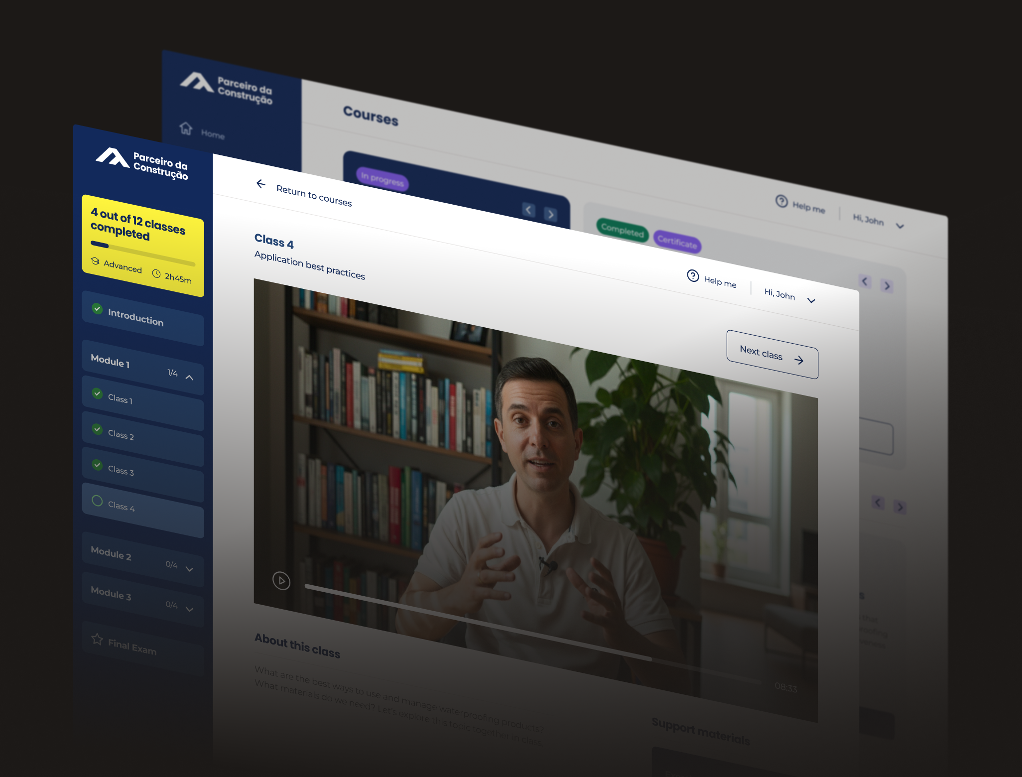
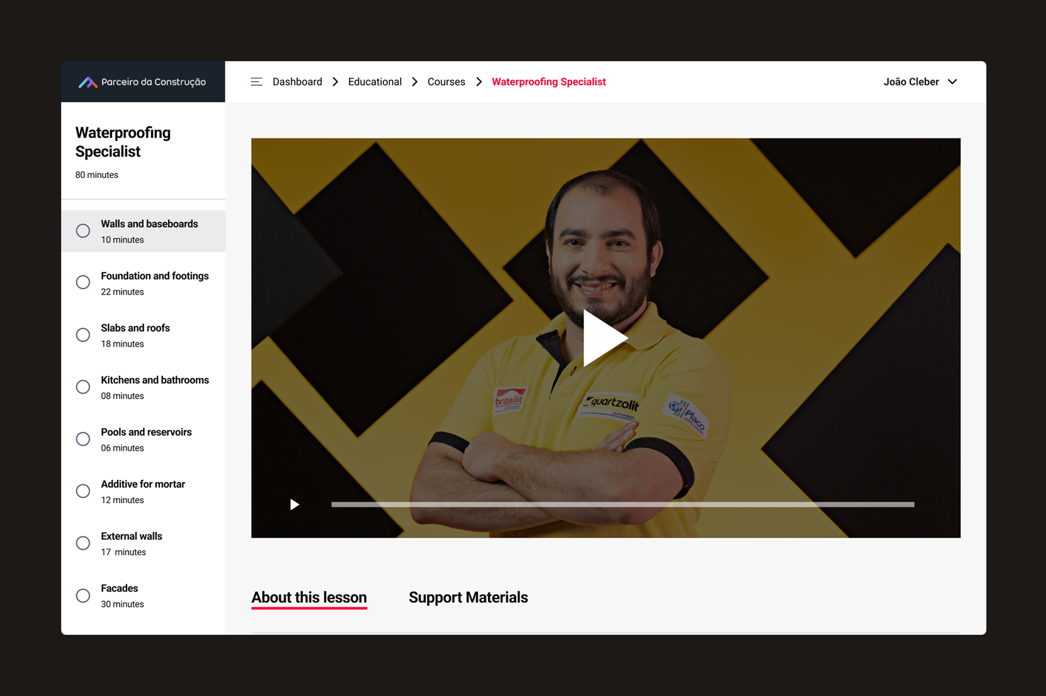
The solution
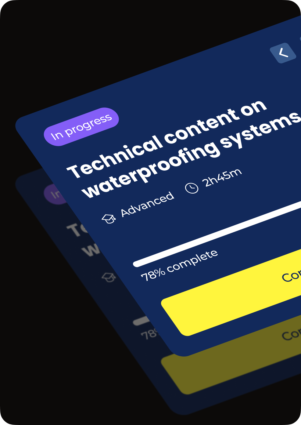
My focus was redesigning the course list and video experience on desktop and mobile to allow users to find in-progress courses quickly and minimise known pain points.
Outcomes
+84% CSAT increase
Customer Satisfaction jumped from 51 to 94 points in the first 30 days after launch, an 84% increase.
58 design tokens implemented
Created a design system foundation with 58 tokens, ensuring visual consistency across the product.