Verizon Connect, 2024
Redesigning a core legacy page that grew traffic 2.5×
I led platform design for a core legacy area, navigating technical constraints while ensuring the solution met user needs. Through user research, I explored users' mental models around vehicle information, then facilitated workshops with product and engineering teams to define scope and rollout phases.
Team: 1 Product Owner, 2 Engineers
Project summary
Challenge
For years, the vehicle area — an essential part of the product that feeds data across the entire platform — had become confusing and overly complicated for users. This created a data gap that limited feature development and hurt the user experience.
Solution
A consistent, scalable design that consolidates vehicle information in a way that matches users' mental models, making data easier to find and use.
Impact
+2.5x traffic growth
The page traffic jumped from ~36K to ~89K visits per month after the release of the redesign.
-4 legacy pages
Deprecated 4 legacy pages, eliminating design debt and reducing maintenance costs.
100% of design system usage
The redesign uses 100% of our design system components, ensuring consistency and making future updates easier to maintain.
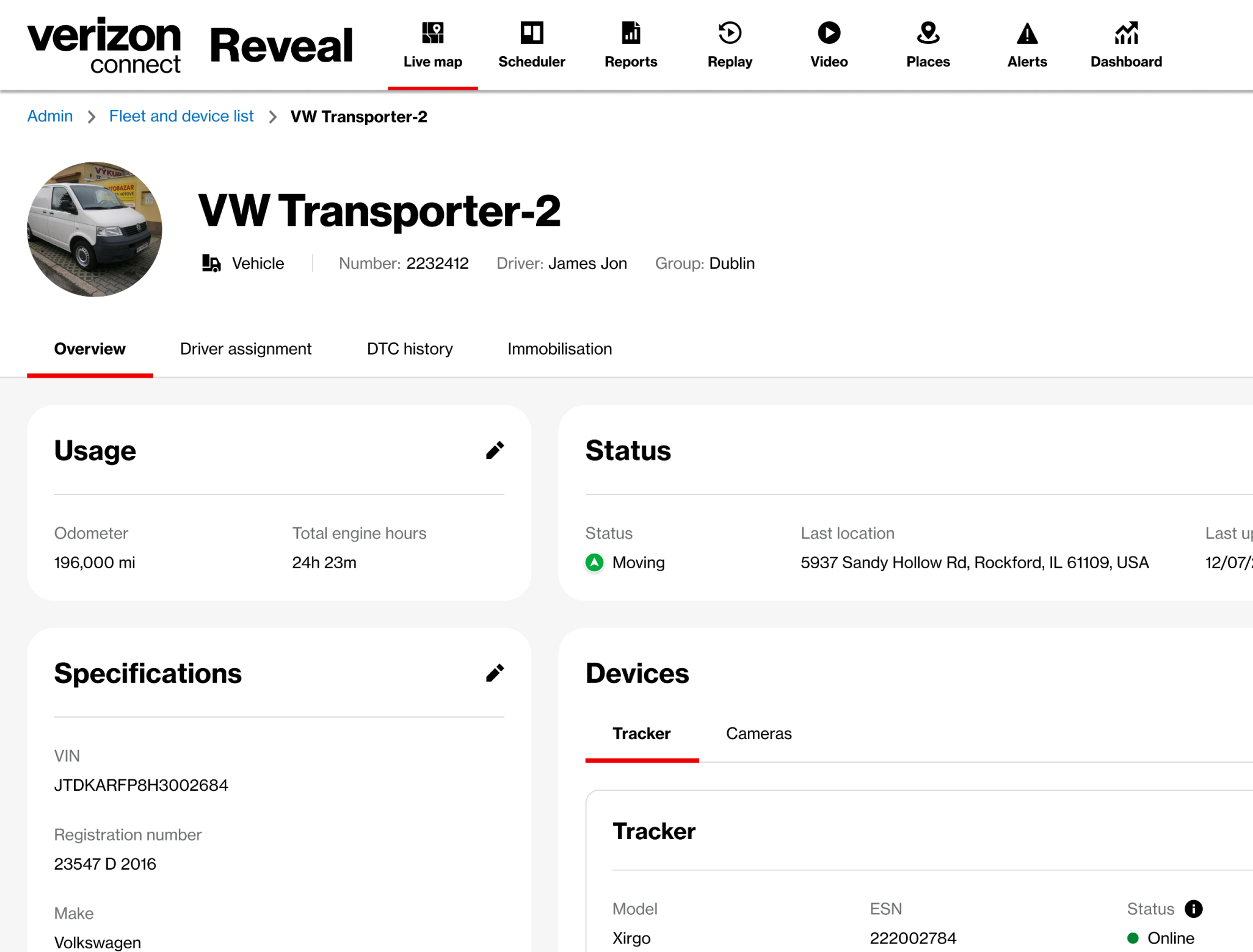
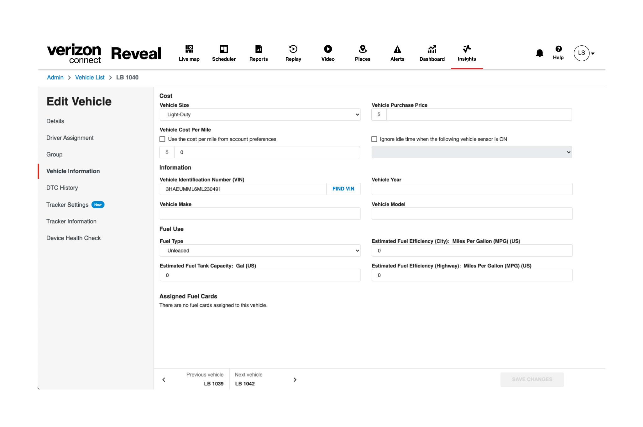
The complexity of a legacy area
The vehicle area was crucial for sharing data across the product. On the technical side, I had to ensure we carried over all functionality into the new redesign. On top of that, I needed to understand the most common user issues and how to improve the information architecture. The legacy system had three major issues: confusing navigation across multiple pages, input fields visible to all users, and poor information grouping that made data hard to find.
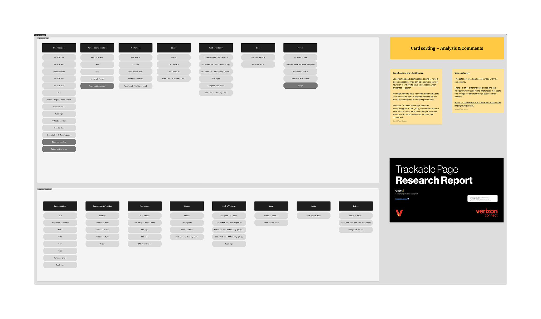
Understanding the user mental model
To reduce the risk of disrupting the user experience, I allocated time during project planning to conduct a comprehensive card sorting exercise with users, helping us remap the information architecture. The results informed the new information architecture and helped engineering gain speed by mapping which APIs would be needed to rebuild that part of the product.
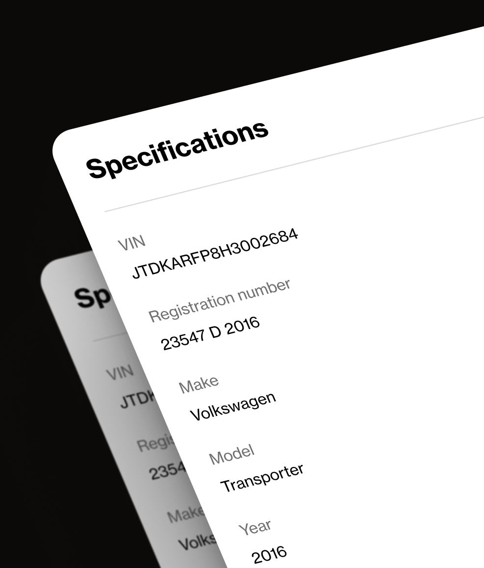
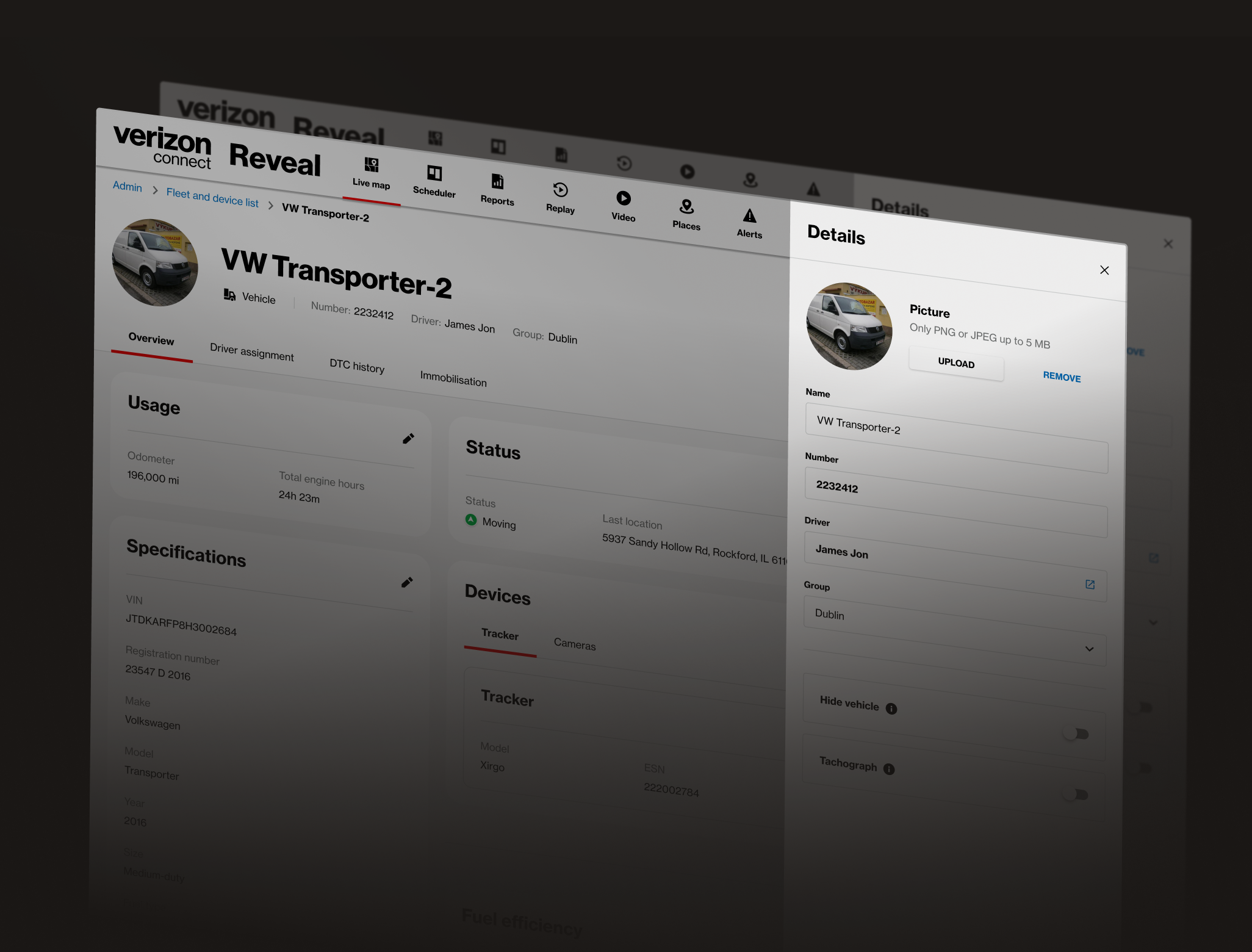
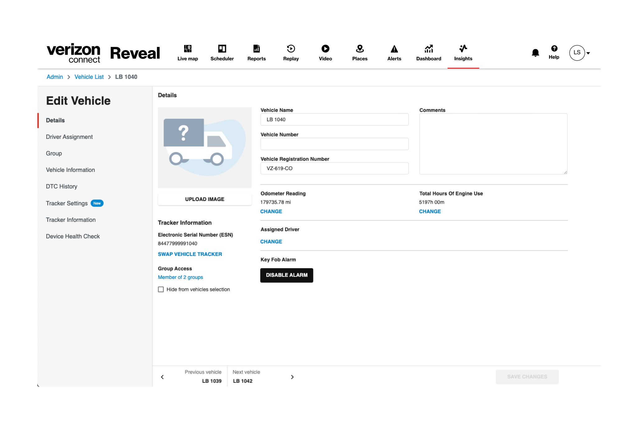
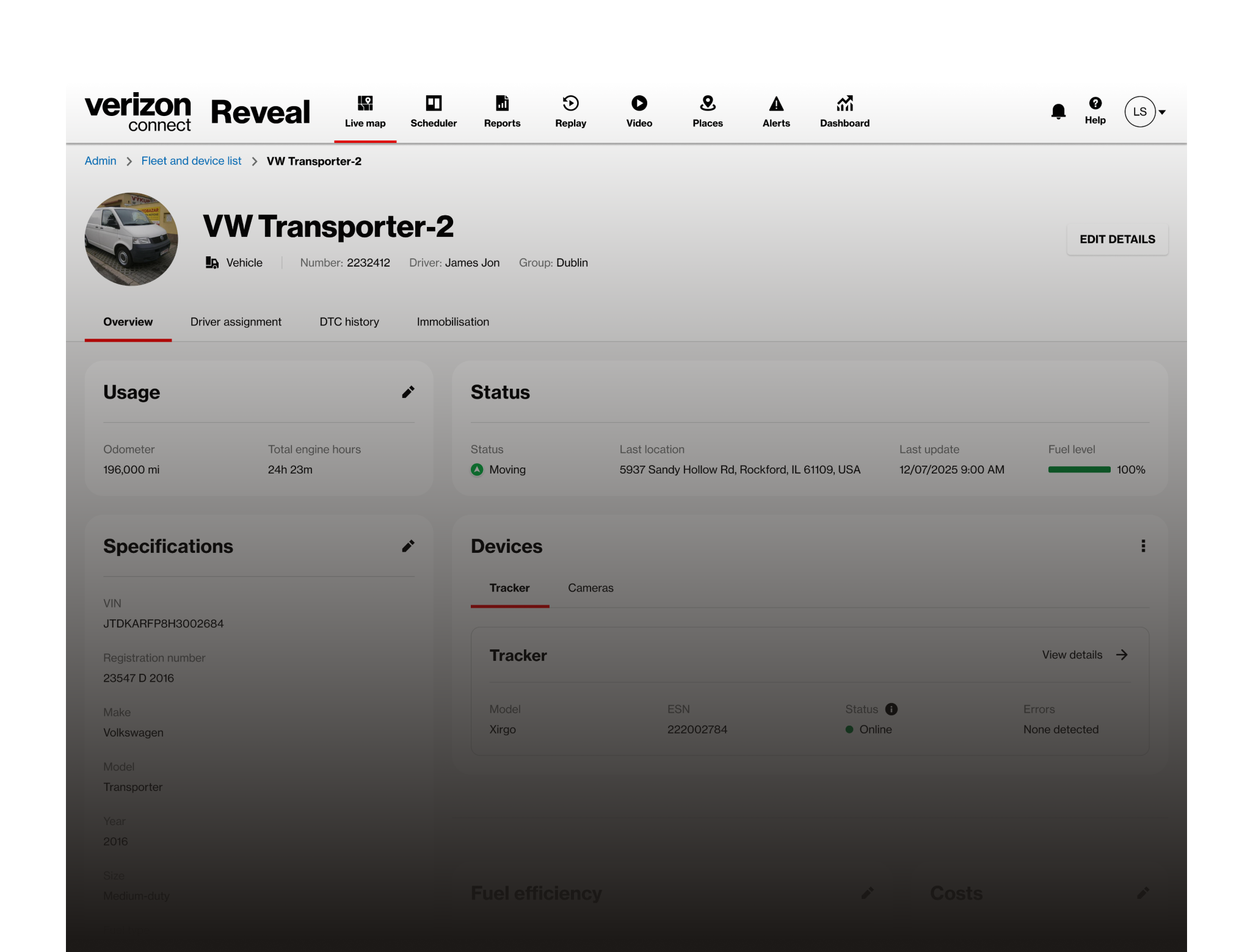
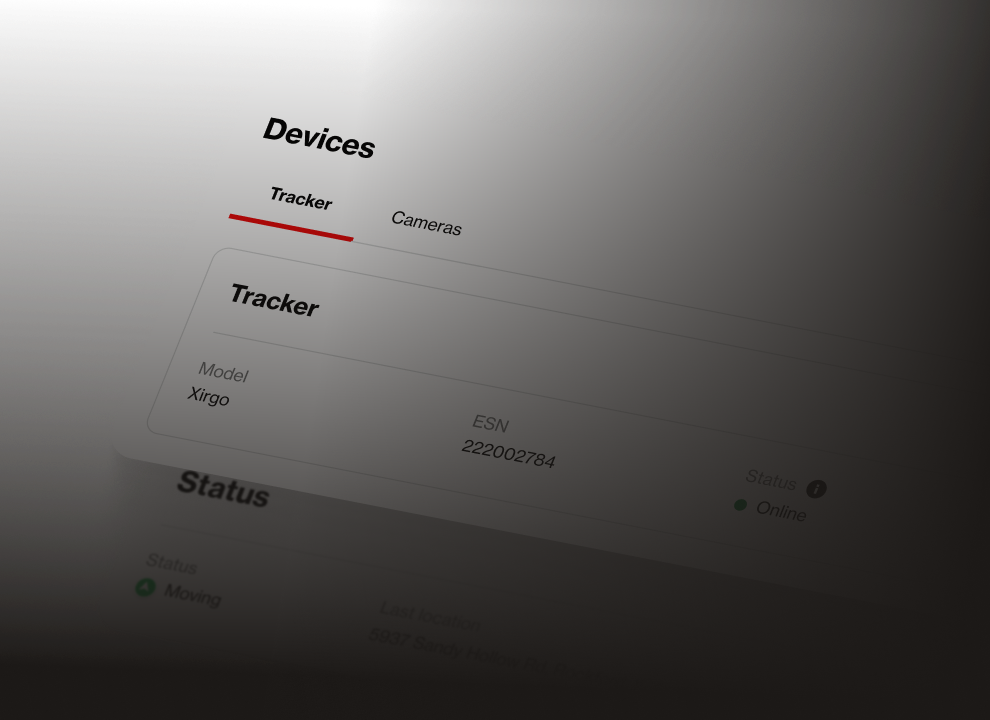
The solution
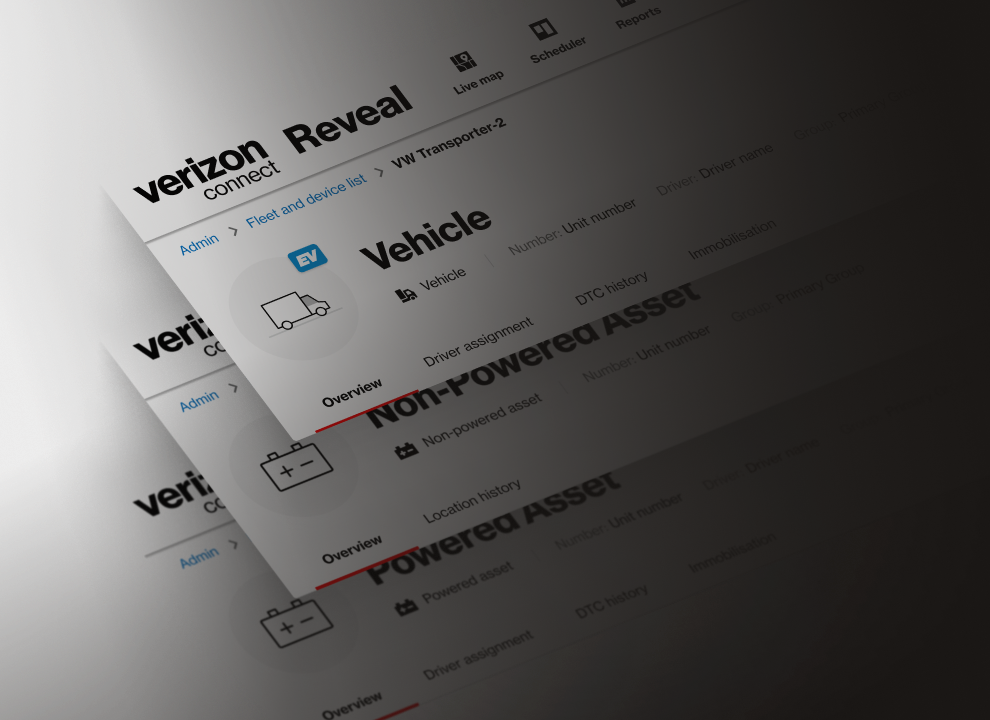
Through comprehensive user research, I redesigned the vehicle area into a simple, scalable layout that helps users spot information quickly and keep vehicle data complete and consistent. The design uses the full design system, ensuring consistency and easier future maintenance. The new structure groups related data logically, removes unnecessary complexity, and scales across different account types.
Outcomes
+2.5x traffic growth
The page traffic jumped from ~36K to ~89K visits per month after the release of the redesign.
-4 legacy pages
Deprecated 4 legacy pages from the old system, eliminating design debt and reducing maintenance costs.
100% of design system usage
The redesign uses 100% of our design system components, ensuring consistency and making future updates easier to maintain.